At NorQuest, we transform lives. And when we do that, we transform communities, we transform the world, we transform the future.
Our brand is guided by accessibility and inclusivity, in alignment with our NorQuest 2030 strategy. The key to the success of our brand is who we include and how we include them.
Our brand
At NorQuest, we aspire to be a place where people come to transform their lives and find a place to belong.
A relentless focus on meeting students where they are, creating systemic change, and being responsive brings to life our efforts toward building a truly anti-racist, equitable, diverse, and inclusive college.
Download the brand book.
Our colours
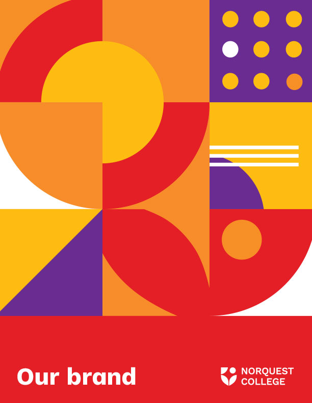
NorQuest’s colour palette is intentional, cohesive, and versatile. The NorQuest brand leads with bright red as its primary colour. Our colour palette can be applied in a variety of ways, and using different combinations showcases its versatility and longevity.
Our font
Work Sans should be used for all print and digital promotional and marketing materials.
Work Sans is a highly accessible, readable, legible, distinct, and unique font. Its full font family can be installed for free from Google Fonts here.
Our logo
The full colour logo should be used as often as possible. The NorQuest logo comes in two versions: horizontal and vertical. To preserve the integrity and clarity of the NorQuest College logo, it must be isolated from other graphic elements.
Download and use the appropriate logo files below:
- For web and MS Office applications: use .png
- For commercial printing: use .eps
Full-colour logos
Horizontal logos
EPS
PNG
Vertical logos
EPS
PNG
One-colour logos
Horizontal logos
EPS
PNG
Vertical logos
EPS
PNG
